Sharing and celebrating the good our employees do in our communities
Wells Fargo Community Impact Site
Wells Fargo & Company is an American multinational financial services and consumer banking company, with over 7,200 branches.
They have hundreds of philanthropic partnerships all over the United States, and wanted to emphasize both the wide range of initiatives as well as their geographic reach in a comprehensive community impact microsite.
The site went through two major iterations:
PART ONE
In the first version, there was a strong emphasis on a mapping component, allowing users to search for philanthropic initiatives in their area. The map would also serve to show the far reach of Wells Fargo partnerships all over the country.
PART TWO
In a redesign, the strategy was to highlight specific categories of philanthropic efforts, rather than quantity and reach, as well as to emphasize Wells’ direct involvement with causes. This update also coincided with a corporate rebrand initiative.
Content hierarchy comparison of both iterations
The First Iteration
The strategy behind the first iteration of the site was focused on driving awareness of the number and range of WF’s philanthropic efforts in communities all over the country.
Mobile view of the landing page, org search, and color-coded category filter.
Desktop view, location search results page.
A color-coded category filter allows users to further distill their results.
Info pages for partnering organizations were designed to accommodate a variety of content types including stories and videos, in addition to contact and engagement opportunities.
The category color-code is always attached to the orgs as they are highlighted throughout the experience.
Minimum mandatory content, below.
The Second Iteration
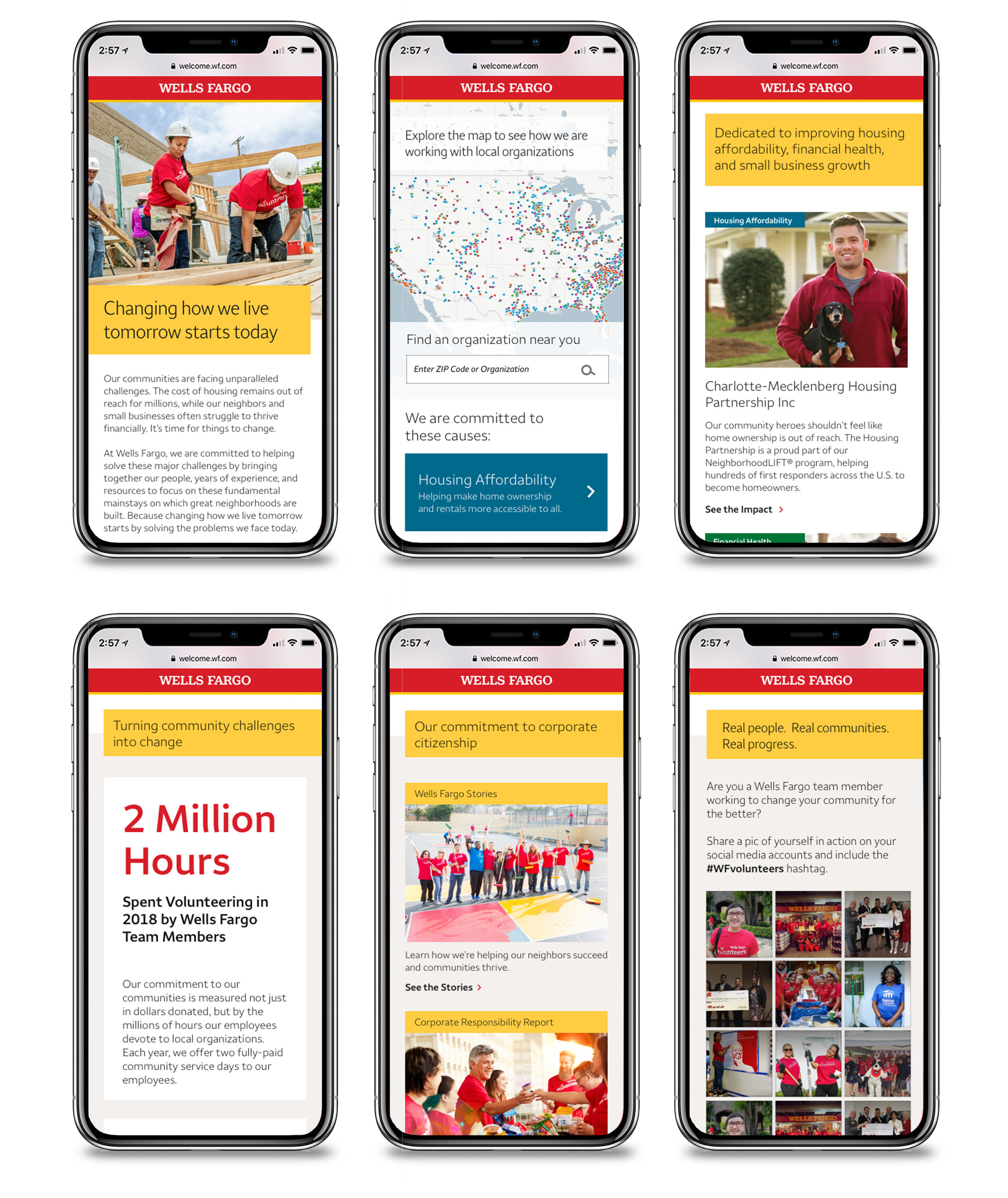
The strategy behind the second iteration was to show how Wells Fargo is hands-on with their community partnerships, especially highlighting categories that are most directly related to their business: Housing Affordability, Financial Health, and Small Business Growth.
This strategy favors stronger empathetic messaging and imagery over the map’s less-humanistic display of quantity and reach.
Mobile views of the landing page components
The search results and partner information pages did not change from the first iteration, save for the branding updates.


