
At Wells Fargo, I help people build wealth, creating experiences that give customers opportunities to save money and build their financial acumen.
With this initiative, the bank can see an uncommon “spike” in cash flow (such as a tax return), so we want to encourage them to save some or all of it.
Encourage customers when they have a chance to save a little extra
Wells Fargo Tax Refund Savings Opportunity
68%
INSIGHT
of Americans say they don’t have enough savings to cover a month’s worth of living expenses
We can make it simple to build savings, boosting customer confidence + control.

DISCOVERY

CUSTOMER JOURNEY
To help our customer, we’d have to plan the mechanics of what the experience entails
We determined that it was important to get the message to the user when they were ready to think about money - when they log into their bank app.
Additionally, an unexpected acknowledgement of their good fortune would “surprise and delight” our customer to know that we’re looking out for them.
DESIGN
EXPLORATORY
We approached the project knowing that we wanted people to feel good about saving money.
A narrative concept would help tie the action to our customers’ emotions, so we started by exploring metaphors for accomplishment and achievement, eventually landing on a concept of “growth”.

Concept Development
We started by collaborating with our group’s brand design team to brainstorm themes and create harmony between imagery and copy.

Art Direction & Illustration
Next, our illustration team did pencil sketches in order get group alignment on concept and art direction.
Testing
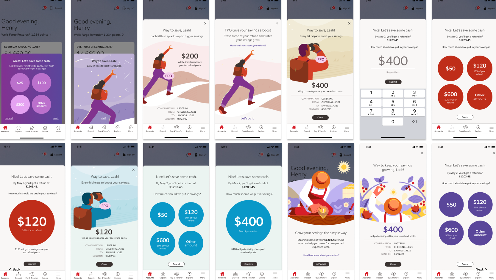
At this point, we ran some studies that were both a little bit usability-testing and concept-testing, with a prototype of the design below.
The overwhelming majority of users welcomed the concept and found the content effective. They welcomed the suggested savings amounts and did not have a problem with the amount selection UI.


Refinement
At last, after making edits from the testing results, we made refinements in color and placed into layout for all view ports.

THE EXPERIENCE

Upon log-in, our customer’s first stop is Account Summary, where (if applicable) they are greeted with a message encouraging them to save money from their tax refund.

If the user opts in, they are shown a full-screen message that feels friendly, simple, and purposeful, with an instant next step to take action.

A selection of amounts is suggested to the user with a quick-action multi-choice UI. The user also may enter an amount that is not listed.

If the user selects “Enter another amount”, they will input the dollar amount via keypad.

An interstitial step restates the amount the user selected, and gives them an opportunity to edit their choice.
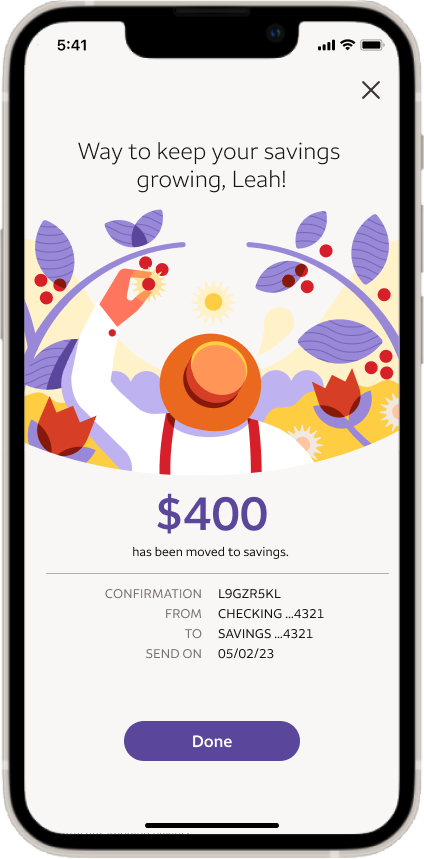
A confirmation screen celebrates the user’s action, illustrated by the character in image harvesting their bounty after planting seeds.